Friday, 8 April 2011
Tuesday, 5 April 2011
Evaluation Question 3: Audience Feedback

- The audience thought the narrative was similar to Romeo and Juliett, in the way they both died.
- They could relate it to the beginning of a horror film as it used flashbacks to reminis on the past.
- The soundtrack was emotive and suited it's purpose.
- The film could be understood without the voice over, this shows our narrative was strong.
- They understood the importance of the tree and liked how it linked to the character's past.
- It could have been the start of a feature length film, if someone had saved him from dying and a new relationship could have formed, and 'bloomed like a tree'.
- The soundtrack makes you sympathise with the man.
- The article proved more effective at advertising the film to this audience than the posters, mainly because the large image on it was more interesting than the ones of the trees on the posters.
- Overall, they enjoyed the film.
After receiving this audience feedback we decided that maybe our film is aimed at a more older audience, as the adult of the group seemed to understand the concept better. After attending a lecture with Roy Stafford and learning about independant films such as, 'Winter's Bone', 'Submarine' and 'Norweigen Wood' I believe our film could fit into the genre of independant films, shown at art houses with an older, middle class audience; partly because of the issues raised in the film, but also because of the unusual camera work and the use of handheld shots for effect. The 17-18 year olds didn't seem to be as enticed by the film as the adult, and their feedback showed they didn't understand the concept as much as we would have liked.
Audience research was collected all the way through our project. We had feedback for the font of our posters, therefore changed them. Also, a main point is the audience feedback from our first film idea which forced us to change our idea, which turned out for the best as the audience responded better to the new idea. As producers we were making our film for the audience, not for ourselves.
Evaluation Question 2: Combination of ancillary and main texts.
 American teaser poster
  American full poster.
  Norweigen film poster.
  English film poster.
 When looking at our three posters I spotted a resemblance to the posters made for the independant film 'Winter's Bone'. Our posters are all different but are advertising the same thing. These three posters are different countries forms of advertising the film, but we can relate our posters being different because they are trying to reach out to a wide variety of audiences.
Thursday, 31 March 2011
Evaluation Question 1: Conventions
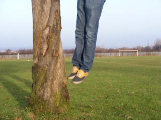
We use a few hand held camera shots in our film, this is done for a reason as we were emulating independant 'lo-fi' style cinema, and use this cinematography to represent the man's personal story. Also, the hand held camera shows how deteriorated the man is after overdosing on paracetamol, this helps the audience to relate to the personal life of the main chararcter and relate to his troubled life.
These clips use hand held camera shots and link to our film:
The Son's Room:This uses similar shots as our film to deal with the man's grief.
Festen: Uses raw techniques, similar to our film as it has a raw and personal feel to the moments that take place.
Run Lola Run: The camera work differs throughout the film and makes it feel like we shouldn't be there. This could link to our film as the story is so personal, it almost feels we shouldn't be watching.
Friday, 25 March 2011
Wednesday, 9 March 2011
Double Page Spread
Tuesday, 8 March 2011
Family Tree, Finnished Product
Here is our finished product, the short film 'Family Tree'. It uses the two concepts, time and technology; time being the flashbacks, the thing that gets back his memories and technology being a killer. This suggest binary opposites in a way that time is good and technology is evil.
Monday, 7 March 2011
Sunday, 6 March 2011
Screenshots
Inspiration

Wednesday, 2 March 2011
Progress
Tuesday, 15 February 2011
Technical Info
- Studio lighting - Car crash scene
- Extreme close up
- point of view shot
- low angle shot
- extreme long shot
- mid shot
- high angle shot
- cross cut
- shot reverse shot
- matched cuts
- motivated cut
Wednesday, 2 February 2011
Location Shots
Tuesday, 1 February 2011
Script for the Voice-over
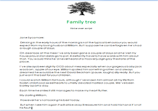
 We decided to use a voice over in our film to make it more understandable and to create emotional impact as it is the dead wife who is talking. This also gives a mental aspect to the main character as he could be hearing voices. The voice over makes the film open with a ghostly feel and will maybe make the audience wonder who it is speaking and make them want to watch the film to find out what has happened.
Saturday, 29 January 2011
Friday, 28 January 2011
Thursday, 27 January 2011
Wednesday, 26 January 2011
Tuesday, 25 January 2011
CHANGE IN FILM IDEA
Monday, 24 January 2011
Audience Feedback on 'Strange Case'
The feedback was negative, mostly because the idea wasn't exciting enough and was slightly confusing. The feedback said that the idea was being repeated and we decided this would not work for an exciting short film, as short films have to make the most of every minute they have to create the best film possible.


